Reeta R.

Diced Kitchen - Mobile APP

A Benchmark Review of the Digital Gift Finder

Overview

ROLE:
UX/UI Design

Timeline:
80+ hours


‍
Tools used:
Figma

ROLE:
UX/UI Design

Timeline: 
80+ hours
‍
Tools used:
Figma


This project is a fictitious scenario, completed as a Mobile APP design for Diced Kitchen

Description

Diced Kitchen is a health meal-prep and food delivery brand focused on providing nutritious, fresh meals without the hassle. The mobile application was designed to streamline the healthy eating experience, offering a digital-first approach to meal browsing, personalized ordering and seamless delivery management.

This project involved designing a full-featured mobile app that allows users to browse meals, place orders, manage payments and track their order history with ease.

Project Goal

The goal of the Diced Kitchen mobile app project was to design a seamless and user-friendly digital experience that allows customers to order healthy, chef-prepared meals quickly and effortlessly. The app was intended to remove common pain points in food ordering by simplifying navigation, reducing the number of steps required to complete an order, and making the overall experience intuitive for both new and returning users.

Another key goal was to enhance meal discovery and engagement through a visually appealing interface. By organizing meals into clear categories and presenting them with rich imagery and concise information, the app helps users make confident choices while reinforcing Diced Kitchen’s fresh and premium brand identity. The design prioritizes clarity, readability, and accessibility across all screens.

The project also aimed to encourage repeat usage by providing features such as saved addresses, multiple payment methods, and order history. These elements were designed to support convenience and build trust, allowing users to reorder meals quickly without re-entering information. Transparent pricing, secure checkout, and clear order confirmations further strengthen user confidence.

Why Mobile APP is require?

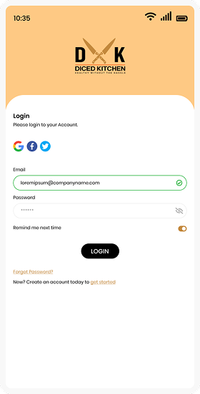
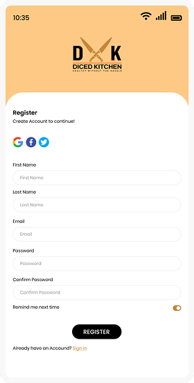
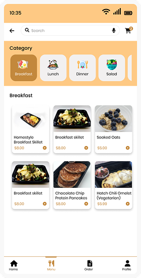
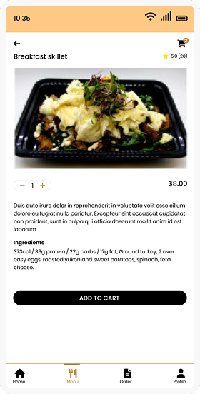
A mobile app is essential for business because it provides a faster, more convenient and more personalized way for customers to interact with the brand. Unlike a website, a mobile app is always accessible on the user’s device, allowing customers to browse meals, place orders and reorder their favorites within seconds. This level of convenience is especially important for users with busy lifestyles who value quick and frictionless food ordering.

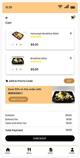
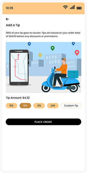
A mobile app helps improve customer retention and engagement. Features such as saved payment methods, stored addresses, order history and push notifications make it easier for users to return and place repeat orders. Notifications about new menus, promotions, or discounts keep the brand top of mind and encourage consistent usage, which is harder to achieve through web-only experiences. From a business perspective, a mobile app strengthens brand loyalty and trust. A dedicated app feels more reliable and professional, offering secure payments, clear order tracking, and instant confirmations. It also allows to collect valuable user behavior insights, helping the business optimize menus, promotions and user experience over time.

Design Process

Empathize

Empathize

Define

Define

Ideate

Ideate

Prototyping

Prototype

01. Empathize - Exploring the User’s Needs

To design the Diced Kitchen app, I started by looking at the daily lives of our customers. Most of them aren’t just looking for food; they are trying to balance a healthy lifestyle with a schedule that never stops. I realized that for a busy professional or a parent on the go, the biggest barrier to eating healthy isn’t a lack of will – t’s decision fatigue and time pressure. When you’re hungry and stressed, the easiest choice is usually the unhealthiest one.

I spent time observing how people interacted with the physical restaurant. I saw the “peak hour” rush where customers looked anxious while standing in long lines, constantly checking their watches. I noticed the confusion in their eyes when they had to customize a bowl with ten different ingredients while a line of people waited behind them. This “social pressure” often leads to ordering errors or settling for a pre-made meal they don’t actually want.

Through this empathy-driven approach, I identified that the app needed to feel like a supportive partner, not just a menu. We needed to remove the “noise” of a crowded restaurant and replace it with a calm, private space where a user could build their perfect meal at their own pace. By understanding that our users feel “guilty” when they eat poorly and “rushed” when they eat well, I focused the design on two things: speed to save their time and transparency to give them peace of mind about what they are putting in their bodies.

Ultimately, the goal was to create an experience that feels like a “win” for the user. We wanted to transform the act of ordering lunch from a stressful chore into a seamless, rewarding ritual that helps them stay on track with their fitness goals without adding any extra weight to their day.

02. Define - Establishing the User's Needs and Problems

Based on user empathy and research insights, the core problem was defined as a need for a fast, clear and reliable mobile experience that allows users to order healthy meals without confusion and unnecessary effort. Users want a solution that fits seamlessly into their busy routines while giving them confidence in their meal choices and purchases.

Many existing food ordering experiences overwhelm users with complex navigation, inconsistent information, and lengthy checkout flows. Users needed a platform that simplifies decision-making, clearly communicates meal details and pricing, and makes reordering effortless.

The design challenge therefore was to create a mobile app that prioritizes speed, clarity and trust. The app needed to guide users smoothly from meal discovery to order completion, reduce cognitive load and support repeat usage through saved preferences and order history.

We defined the app’s value not just as “food delivery,” but as “Dietary Control.” By moving the ordering process to a mobile interface, we give the user control over their nutrition and control over their schedule.

03. Ideate - Translating Problems into Solutions

During the ideation phase, multiple solutions were explored to address the defined user problems and align with Diced Kitchen’s business goals. The focus was on creating an experience that feels effortless, intuitive, and supportive of users’ daily routines. Ideas were generated around reducing friction, improving meal discovery, and encouraging repeat orders.

Key concepts included a clean home screen with clear meal categories, visually rich food cards to support quick decision-making, and a simplified checkout flow with minimal steps. To support returning users, ideas such as saved addresses, stored payment methods, and easy access to order history were prioritized to enable fast reordering.

The team also explored ways to build trust and transparency through clear pricing breakdowns, order confirmation screens and visible success states. Optional features like promo codes, tipping options and future loyalty rewards were ideated to enhance user engagement without overwhelming the core experience.

04. Final Design & Prototype – The Polished Experience!

In the Prototyping stage, I turned my wireframes and ideas into a high-fidelity, interactive experience. The goal was to simulate the real-world feel of ordering a meal, ensuring every transition felt smooth and every tap was purposeful.

Prototyping: Bringing the Vision to Life

Using the finalized visual style, I developed a high-fidelity prototype that focused on flow and feedback. I wanted to ensure that the transition from a “hungry user” to a “satisfied customer” felt effortless.

High-fidelity interactive prototypes were developed to closely resemble the final product. These prototypes focused on realistic interactions such as tapping through meal categories, adding items to the cart, applying promo codes, selecting payment methods, and completing an order. Attention was given to micro-interactions and feedback states to ensure users always understood what action had been completed.

The prototype showed that users felt more comfortable and confident when they could see the total price update instantly as they added items. This real-time feedback helped avoid surprises at checkout and made the payment process feel more transparent and trustworthy.

Hi-Fidelity Designs on Mobile
Splash Screen 1
Splash Screen 2
Splash Screen 3
Splash Screen 4
Splash Screen 5
Splash Screen 6
Splash Screen 7
Splash Screen 8
Splash Screen 9
Splash Screen 10
Splash Screen 12
Splash Screen 13
Splash Screen 14
Splash Screen 15
Splash Screen 16
Splash Screen 17
Splash Screen 18
Splash Screen 19
reeta rani

Reeta Rani

Creative Lead - UI/UX

Designed with heart and a few sleepless nights

Disclaimer!

These designs are shared purely to showcase my work and experience. They don’t suggest ownership or any present partnership with the brands or companies featured.